Mixing skin tones with acrylics: natural colours for portraits
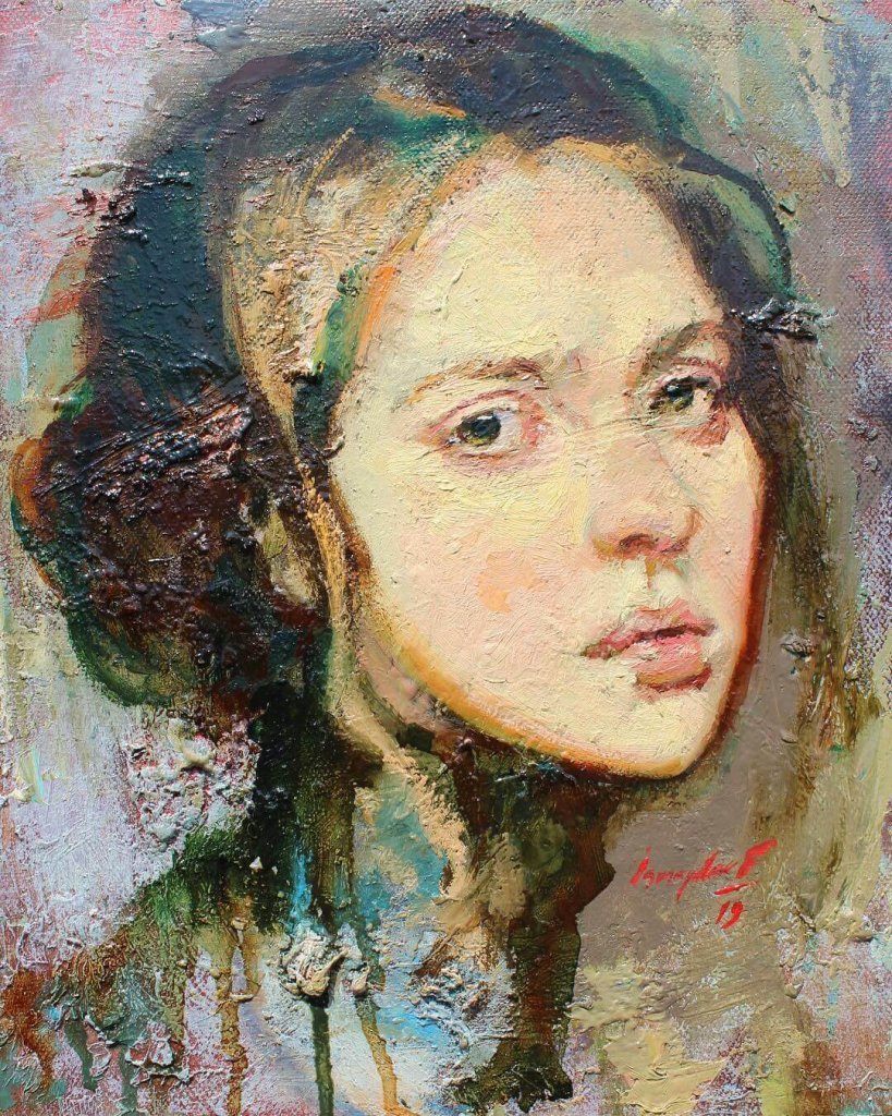
Mixing skin tones with acrylics works best with just a few colours: yellow ochre, cadmium red (or another warm red), ultramarine blue and titanium white cover almost every skin colour. What matters is not a ready-made "skin recipe" but knowing how to make a base tone lighter, darker, warmer or cooler. In this article I show you step by step how to build natural skin tones – and which mistakes to avoid.
Why skin tones in acrylic are tricky
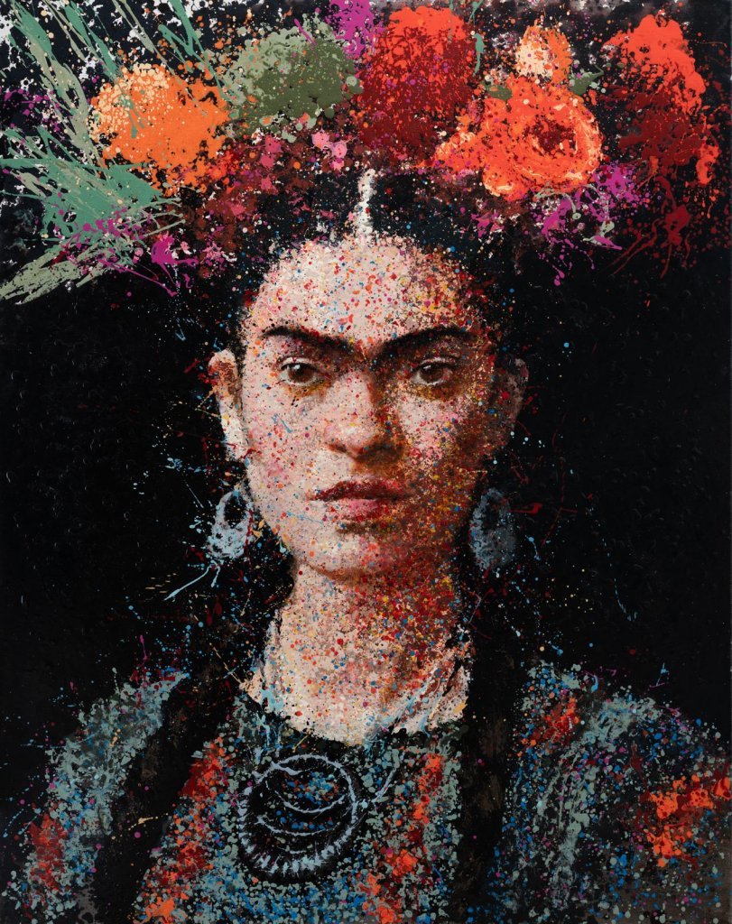
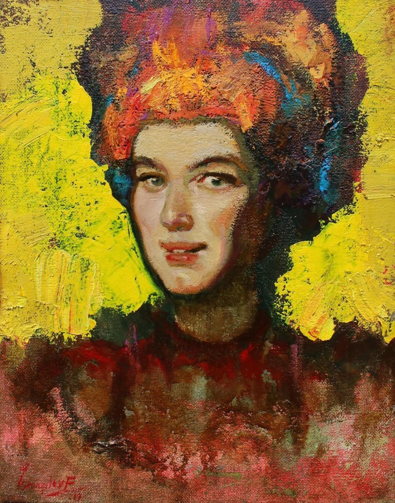
Skin is never a single colour. The forehead often looks more yellow, the cheeks, nose and ears redder, and the chin and eye sockets cooler, almost greenish or bluish. If you paint a portrait with one "flesh colour" straight from the tube, the face quickly looks flat and mask-like.
Acrylics add a second difficulty: they dry fast and usually a little darker than they look wet on the palette. Mix slightly lighter than you think you need and test the tone on a small area first.
The basic palette
- Titanium white – for lightening, opaque
- Yellow ochre – the warm, earthy base of many skin tones
- Cadmium red light or a similar warm red – for warmth
- Ultramarine blue – for darkening and cooling
- optional burnt sienna or burnt umber – for darker skin and deep shadows
- optional alizarin crimson or another cool red – for lips and cool reds
How these colours relate on the colour wheel is explained in my article on colour theory for painting.
The base mix step by step
- Put some yellow ochre on your palette.
- Add a little red until you get a warm, slightly orange brown.
- Lighten it with titanium white in small steps – too much white kills the glow.
- If the tone looks too orange or "candy-like", tone it down with a tiny touch of ultramarine, the complementary colour of orange.
Always compare your mix with the reference and ask three questions: too light or too dark? Too warm or too cool? Too intense or too grey?
Lighter and darker skin tones
Lights
Add more white for the lit side of the face, but also a touch of ochre or warm red – white alone makes skin chalky. Place the brightest highlights last.
Darks
For darker skin or the shadow side, use less white and work with burnt sienna, burnt umber and some ultramarine. Dark skin is very colourful, with warm reds and golds in the lights and cool, bluish reflections in the shadows.
Warm and cool: making skin come alive
- Forehead: yellowish and light – more ochre
- Middle zone (cheeks, nose, ears): reddish – more red
- Lower zone (chin, mouth area): cooler – a hint of blue or green
Treat these zones as a guide, not a rule. You see the differences especially well when painting a real person, as in my article on painting a partner portrait.
Shadows without black
Black only darkens and makes shadows look dirty. Build them from colour instead: base mix plus ultramarine for a cool shadow, burnt umber plus ultramarine for deep accents, and a hint of green for transitions. Watch out for reflected light along the jaw – it makes the face look three-dimensional.
Common mistakes
- Too much white – chalky, doll-like skin.
- Black for shadows – grey, muddy areas.
- Only one skin tone – a face needs at least three to five values.
- Mixing too little paint – acrylic dries fast; mix generous amounts and mist the palette.
- Dabbing in tiny strokes – lay in larger areas and blend while wet.
Acrylic or oil?
The mixes are very similar; the difference is drying time. Oil gives you time for soft blending, acrylic asks for faster work or thin layers. For oil recipes see the 5 most important colour mixes for portraits in oil.
Frequently asked questions
Can I buy ready-made skin colour?
Yes, but it rarely matches your reference and almost always needs adjusting. Mixing your own teaches you more.
Why does my tone look different on the canvas?
Acrylics dry slightly darker, and every colour changes with its surroundings. Judge your tones within the painting.
How many skin tones do I need?
Start with three: light, mid-tone and shadow. Add transitions, warm and cool accents and highlights later.
Conclusion
Make a small colour chart – one row from light to dark, one from warm to cool – and you will quickly see how each colour changes your mix. It is even easier with personal guidance: in my painting courses we mix colours together at the easel. I look forward to seeing you there.
Gallery